When you upload an image to your website, WordPress automatically creates several versions of the image at different resolutions. These resolutions are determined by the thumbnail sizes that are registered by your plugins and themes. The version of the image that gets displayed when your pages load can affect the image's size and quality, as well as the load time for your page.
Using images that are larger than necessary for their container can negatively impact everything from page responsiveness to your Google page rankings. In the past, web designers would create images at the exact size they needed to appear on screen. However, with the advent of responsive design and the wide variety of screen sizes on today's web devices, this approach is no longer practical.
Instead, it's more effective to think of your image as needing to fit inside a container. The size of this container (measured in pixels) will vary depending on the display. Therefore, we need to provide the browser with a selection of image files at varying resolutions to choose from. This allows the browser to select the most suitable image to fill the container when the page is rendered.
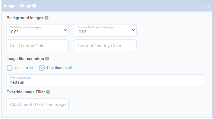
The image file resolution settings in Advanced Grid Builder are designed to give you complete control over which images get loaded into your grid.
Fields
Use srcset
By enabling this feature and entering a 'srcset requested resolutions' value, you allow your browser to choose the best image to load based on the expected container size of your image and the display scaling in your operating system. To avoid size popping, Advanced Grid Builder will only include uncropped image sources with the same aspect ratio as the original. Understanding which file your browser chooses can be a bit complex - there is a helpful explanation here.
You can supply a comma-separated list of sizes for each responsive media queries you have configured in cell sizing. Values are validated when you press update to ensure they are consistent with the current breakpoint settings, and have a valid css unit.
Use thumbnail
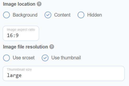
Select this option and choose a 'thumbnail size' to specify the exact source file to load. Selecting 'full' will load the originally uploaded file at its full resolution.
Example
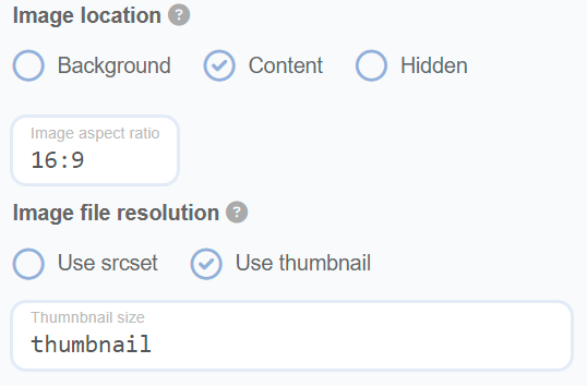
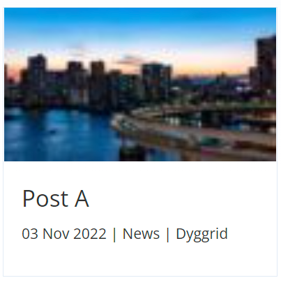
As an example of how these settings can impact your site, the following settings result in a blurry image because the image your browser loads is too small and gets stretched to fill the container:
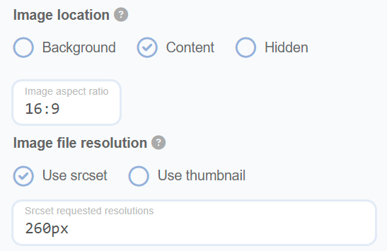
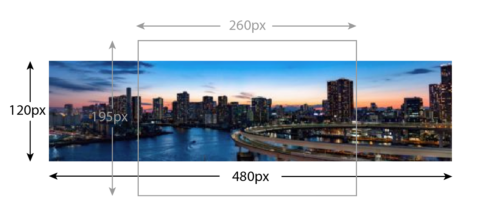
If you know the expected image container size (in this case 260px), we can let the browser choose the source to load based on your screen's pixel density and the available source sizes. In this example, by using the browser's inspect tools we can see the medium (480px wide) size was loaded. However, note that the image is unexpectedly still blurry.
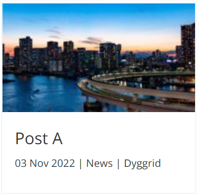
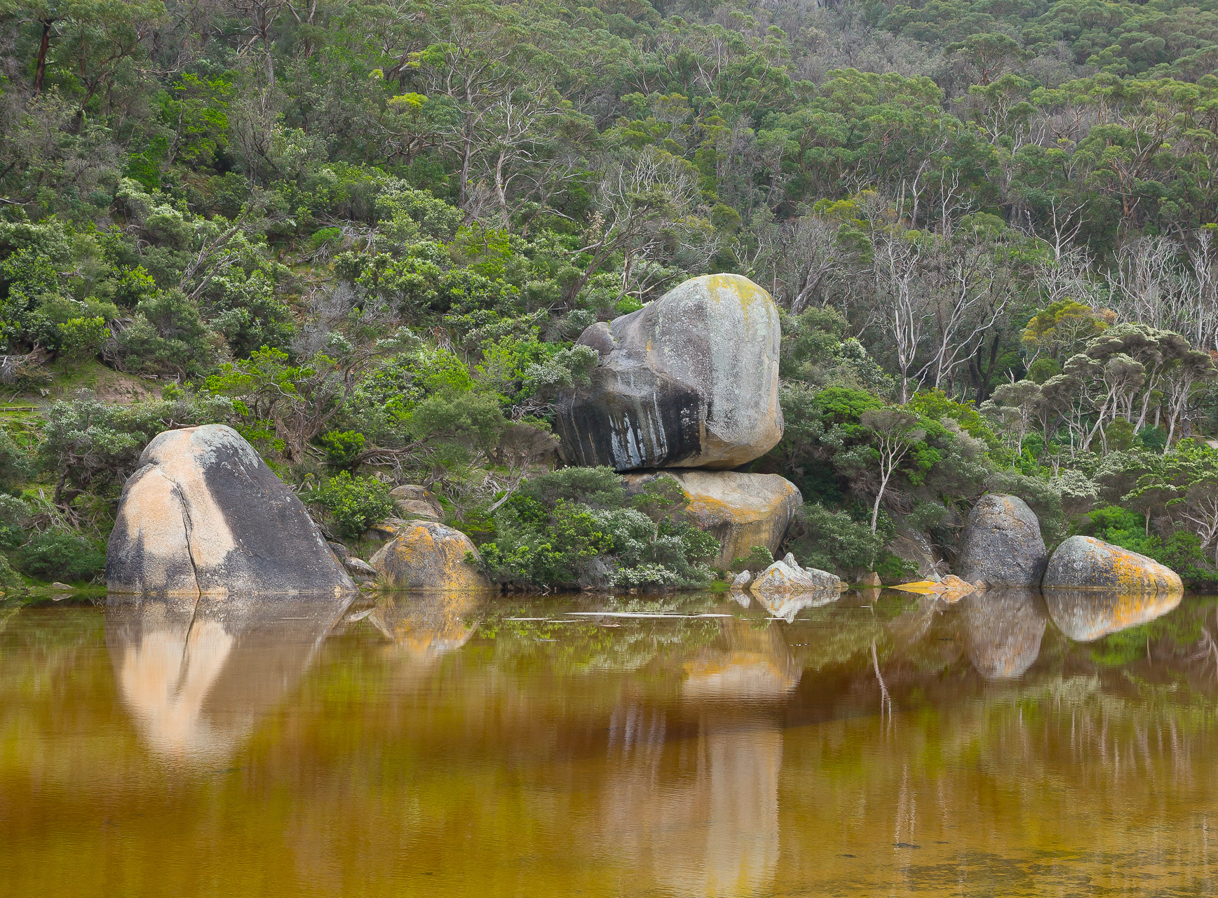
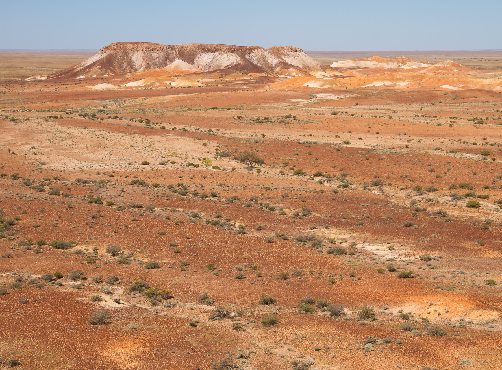
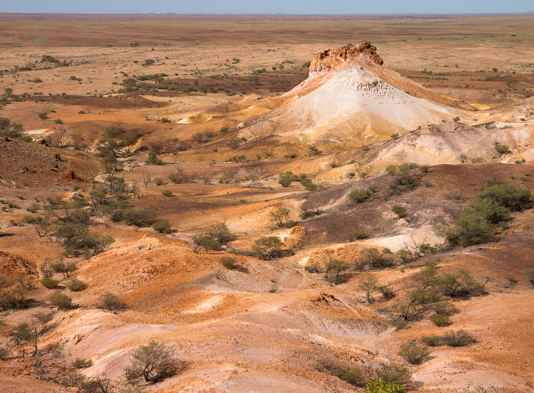
The reason in this case is because the underlying original is a panorama but we have a 16:9 aspect ratio selected for the container. The image is being stretched to fill the container because there is not enough vertical resolution. When resolving srcset options, browsers only consider the container's width requirements, not height.
Normally we would recommend that you do use srcset as it will choose the best image in most situations. However, in this particular case where each image in your grid has a very different aspect ratio, the solution is to select a larger source file to make sure the image is crystal clear:
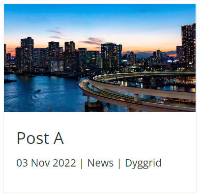
You can explore these settings yourself in the following demo:
Lorem ipsum dolor sit amet, consectetur adipiscing elit, sed do eiusmod tempor incididunt ut labore et dolore magna aliqua. Ut enim ad minim veniam, quis nostrud exercitation ullamco laboris nisi ut aliquip ex ea commodo consequat. Duis aute irure dolor in reprehenderit in voluptate velit esse cillum dolore eu fugiat nulla pariatur. Excepteur sint occaecat […]
Lorem ipsum dolor sit amet, consectetur adipiscing elit, sed do eiusmod tempor incididunt ut labore et dolore magna aliqua. Ut enim ad minim veniam, quis nostrud exercitation ullamco laboris nisi ut aliquip ex ea commodo consequat. Duis aute irure dolor in reprehenderit in voluptate velit esse cillum dolore eu fugiat nulla pariatur. Excepteur sint occaecat […]
Lorem ipsum dolor sit amet, consectetur adipiscing elit, sed do eiusmod tempor incididunt ut labore et dolore magna aliqua. Ut enim ad minim veniam, quis nostrud exercitation ullamco laboris nisi ut aliquip ex ea commodo consequat. Duis aute irure dolor in reprehenderit in voluptate velit esse cillum dolore eu fugiat nulla pariatur. Excepteur sint occaecat […]
Lorem ipsum dolor sit amet, consectetur adipiscing elit, sed do eiusmod tempor incididunt ut labore et dolore magna aliqua. Ut enim ad minim veniam, quis nostrud exercitation ullamco laboris nisi ut aliquip ex ea commodo consequat. Duis aute irure dolor in reprehenderit in voluptate velit esse cillum dolore eu fugiat nulla pariatur. Excepteur sint occaecat […]
