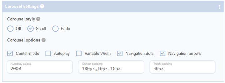
Center Mode
Engage 'Center Mode' to spotlight the active slide in your carousel. This feature not only highlights the current slide but also provides previews of the surrounding slides. The central slide is further emphasized through magnification.
Notes:
- For best results, pair 'Center Mode' with an odd number of slides, determined by the number of columns in the Cell Layout settings.
- Upon initial rendering of a carousel with 'Center Mode' active, the last slide in the sequence will appear to the immediate left of the centered first slide due to the carousel's wrap-around nature. If your Number of Posts configuration does not supply enough posts to populate your carousel on the first page, a load more button may appear and/or trigger an AJAX load more event. This could potentially confuse visitors. To prevent this, we recommend configuring these settings to avoid displaying a load more button when using 'Center Mode'.
Center Padding
Enhance your carousel's interactivity with 'Center Padding'. When 'Center Mode' is activated, this setting introduces padding to the left and right edges, subtly revealing portions of the adjacent slides within the viewing boundary. This visual cue encourages user interaction, subtly indicating the availability of additional slides.
Track Padding
Ensure your slides' styling effects are fully visible with 'Track Padding'. Certain CSS effects, like transforms and drop shadows, might be clipped by the carousel track's boundary. By adding padding to the top and bottom of the track, this setting accommodates these additional styles, preventing any unwanted clipping. Use 'Track Padding' to maintain the full visual impact of your slides.
Autoplay
Switch on 'Autoplay' to allow your carousel to cycle through slides automatically. This feature is perfect for a hands-free showcase of your content.
Autoplay Speed
With 'Autoplay' on, use the 'Autoplay Speed' setting to control the display duration of each slide. Set in milliseconds, this feature lets you adjust the pace of your carousel to suit your content and audience.
Variable Width
Turn on 'Variable Width' to let each slide in your carousel retain its original width. This feature is ideal when your slides contain content of different widths.
Note: This feature may yield unpredictable results. For best outcomes, use it with the Fixed Width Cell Layout setting activated.
Navigation Dots
Enable 'Navigation Dots' to add a series of dots beneath your carousel. Each dot corresponds to a slide, allowing users to navigate directly to a specific slide. This feature is a great way to keep users informed about the number of slides and their current position.
Navigation Arrows
Switch on 'Navigation Arrows' to add arrow buttons on either side of your carousel. These arrows allow users to manually navigate through the slides, offering a user-friendly way to explore your content.
