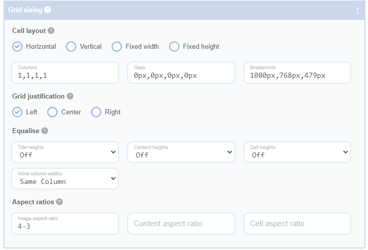
The cell layout settings in the Advanced Grid Builder plugin allow you to customise the appearance of your grid. These settings control the size and number of columns in your grid at each responsive breakpoint, as well as the direction in which it fills. A responsive breakpoint is a point at which the layout of your website will change to accommodate different screen sizes.
For horizontal and vertical layouts, the grid is based on a specified number of columns that scale to fill the width of the grid's container. The number of columns can change based on the width of the screen. The diagram above shows how the size of the screen will map to the number of columns based on the settings.
Horizontal
Horizontal layouts are column-based and fill horizontally. Here, you can enter the number of columns, the size of the gaps between columns, and the responsive breakpoint settings.
Vertical
Vertical layouts fill vertically before spreading across the columns. The columns will fill in such a way that they reach the same height as much as possible. Here too, you can enter the number of columns, the size of the gaps between columns, and the responsive breakpoint settings.
Fixed Width
Fixed width cells will fill from left to right and wrap to the next line when it is full. The number that fit on each line will depend on the screen size.
Columns
Enter the number of columns separated by commas for your grid layout at each breakpoint. As illustrated in the diagram above, you should enter 1 more column than the number of breakpoints. If there are fewer columns specified then the last number will be used for all remaining breakpoints. Columns are now validated when the update button is pressed to ensure they contain 1 more value than the number of breakpoints.
Gaps
Enter the gap size between rows and columns for your horizontal and vertical layouts. These are a comma-separated list for each responsive breakpoint. Your column gaps should be specified with a css unit. If a valid css unit is not provided, it will be corrected to 'px' upon pressing the update button.
Breakpoints
Enter a comma-separated list of breakpoints. Any number of breakpoints can be specified, but they will only take effect if there is a corresponding column specified. It is best to ensure the columns and gaps list always have 1 more entry then you have in your breakpoint list (see diagram above). Breakpoints are now validated to ensure they have a valid css unit. If a valid css unit is not provided, it will be corrected to 'px' upon pressing the update button.
Cell Width
Cell width applies to fixed width layouts. Enter the width along with a css unit.
Cell Margins
For fixed width layouts, set a cell margin to determine the spacing between cells. This setting follows standard css shorthand notation for margins and should include a css unit.
