Grid Sizing
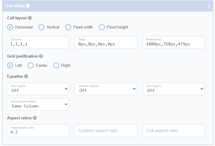
The Grid Sizing Panel in the Advanced Grid Builder plugin provides a comprehensive suite of options for customising the layout and appearance of your grid cells. It allows you to adjust cell dimensions, responsive behaviour, equalise heights, and set aspect ratios.
The ‘Equalise Heights’ feature within the Grid Sizing Panel has three fields for title heights, content heights, and cell heights. Each of these fields offers options for equalising heights within the same row, across all cells, or turning off the feature. This ensures consistency in the presentation of your grid content.
The ‘Aspect Ratios’ feature includes three fields for image aspect ratio, content aspect ratio, and cell aspect ratio. This gives you control over the proportional dimensions of different elements within your grid cells.
In addition to these features, the Grid Sizing Panel also offers the ability to adjust cell layout and grid justification. The cell layout controls the arrangement of cells within the grid, while grid justification adjusts the horizontal alignment of cells within the grid.
By consolidating these features into the Grid Sizing Panel, the Advanced Grid Builder plugin provides a centralised location for controlling the size, shape, and layout of your grid cells. This ensures that your grid is not only visually appealing but also responsive and adaptable to different screen sizes and devices.